Introduction
soroban’s pcaModule perform pca
analysis and generates Biplot.
In this article, we’ll use scholarship dataset of datatoys
This article is based on 0.0.1 Version of soroban
Declare module
soroban’s module assumes that used in the Shiny application.
and You can use snippet(type shinyapp) to build very
basic shiny application.
library(shiny)

ui <- fluidPage(

)

server <- function(input, output, session) {

}

shinyApp(ui, server)
This application will show nothing.
So let’s add pcaModule in ui.
ui <- fluidPage(
  mod_pcaModule_ui(
    id = 'module'
  )
)
also, pcaModule in server.
server <- function(input, output, session) {
  mod_pcaModule_server(
    id = 'module',
    inputData = reactive(datatoys::scholarship)
  )
}
So final (which is very basic) code will like this. (Assume data from
AER loaded.)
library(shiny)

ui <- fluidPage(
  mod_pcaModule_ui(
    id = 'module'
  )
)

server <- function(input, output, session) {
  mod_pcaModule_server(
    id = 'module',
    inputData = reactive(datatoys::scholarship) # remotes::install_github('statgarten/datatoys')
  )
}

shinyApp(ui, server) # Run application
You should notice 2 things.
- both
idin ui and server should be same. -
inputDatain server should be format of reactive
Structure of pcaModule
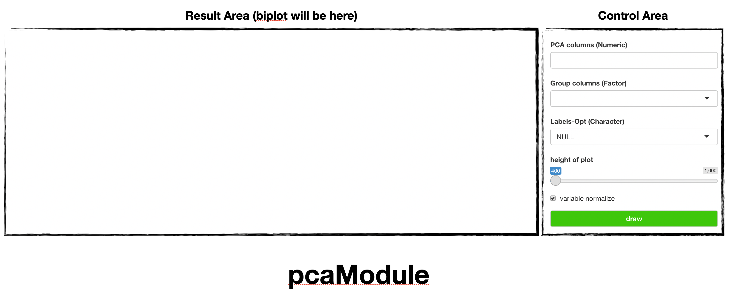
pcaModule is consisted with Control Area and
Result Area
and below using flow.
- Declare module (we did already)
- select variable to analysis. (and if data has different scale, check
normalize) 2-1. (Optional) adjust plot’s height (we consider modify UI in further version) Draw
Usage of pcaModule
Using scholarship, we’ll see which factor makes
university differ.
However, we should change data’s type first.
since PCA module requires options with types.
- change
학제별to factor. it has category withUniversityandCollege.
mod_pcaModule_server(
    id = 'module',
    inputData = reactive(datatoys::scholarship %>% mutate())
)- fill variables like below image; they mean type of scholarship. (other are sum of schoar so they removed)
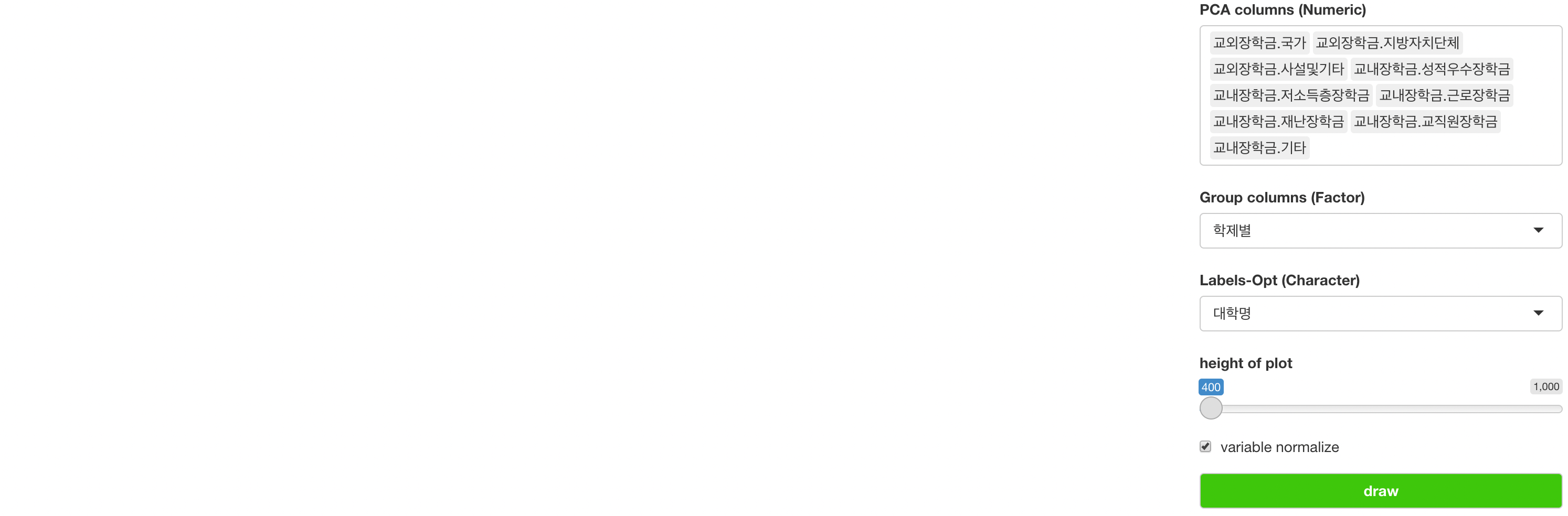
(대학명 means name of university, which will be used
Label (optional))
then result will be shown.
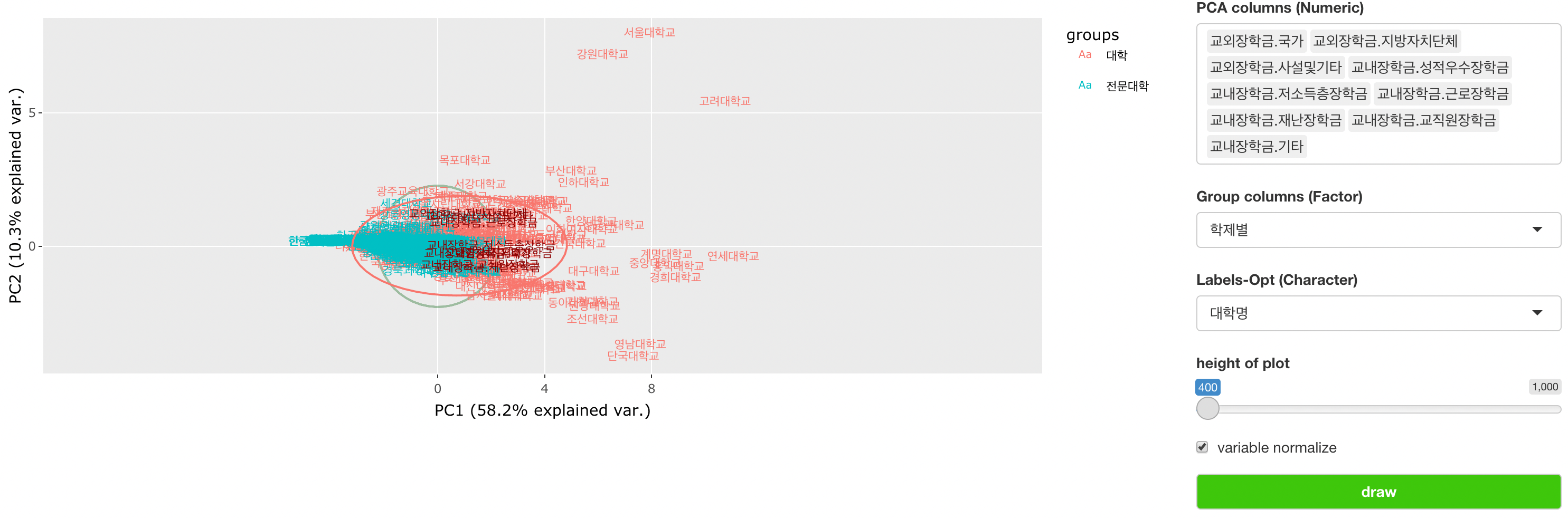
note that some university shows like outlier, which means they provide more scholarships to student. (like Seoul Univ.)
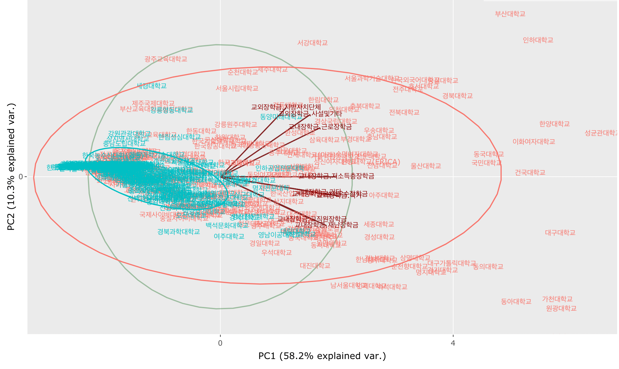
After some move / zoom figure (it uses plotly so you can use their interactive feature), we can see many types of scholarship is provided forward Red that is university and Blue is college.
For any issue or suggestion, please make issue in soroban’s github.